
Trying to Navigate Website Navigation
Let’s start off with a simple task. Most web users can find the primary navigation on the image below, but take a few moments to see if you can find the secondary navigation.

If you had a problem definitively identifying it, you aren’t alone. Even information architecture (IA) experts like Lou Rosenfeld, Steve Krug, Jesse James Garrett, and Jakob Nielsen don’t agree as to what “secondary navigation” is.
When working with website stakeholders, it’s important to have a clear and consistent shared vocabulary for discussing website navigation and IA. It avoids confusion and mistakes.
In addition, having clearly labeled navigation types to choose from can help people organize the information more easily.
For us professionals, having standardized nomenclature allow us to discuss and explore the subject more easily.
In this article, we’ll look at the current status of website navigation terminology.
What Do Experts Agree On?
Let’s start with what everyone agrees on. The experts all agree that most sites have some sort of main navigation. This navigation is usually (but not always) consistent across all web pages of the site, so it’s always there when your site’s visitors need to access it.
It’s usually situated where most of your users go to find most of the information they need, and is often presented as a horizontal bar at the top of the layout or as a vertical list of links on the left- or right-hand side of the layout.

Steve Krug (author of the groundbreaking usability book, Don’t Make Me Think!) and Jesse James Garrett (who many of you might know as the person who coined the term, “Ajax”) call this global navigation, but most others call this primary navigation.
Both terms make sense to me, and while I’ve always felt that “primary navigation” is the most logical name to refer to this type of navigation menu, I must concede that “global navigation” may be more descriptive and versatile.
Secondary and Tertiary Navigation
In the book, Information Architecture for the World Wide Web, Peter Morville and Louis Rosenfeld defined secondary navigation as navigation that’s “subservient to the primary navigation.”
This always made a lot of sense to me, and our company has adopted the primary/secondary/tertiary navigation naming convention. It’s worked very well for us and is something that most of our clients understand very quickly and easily.
 Secondary (and tertiary) navigation are often thought of as “subservient” to primary navigation. This can be visually represented using a flyout navigation or using a left-hand secondary navigation.
Not everyone agrees that secondary and tertiary are inherently “subservient” navigation, so I’d be curious to hear if there’s an industry-wide agreement on this.
What About Everything Else?
While the primary/secondary/tertiary navigation scheme works great for most of the navigation items on your website, it simply doesn’t work for all of them.
The least controversial of the other common navigation is the footer navigation. Regardless of whether it’s a mirror of the primary navigation, a whole new navigation, or just some links to auxiliary pages like the site’s Terms of Service (ToS) page, most people agree to call this the footer or the footer navigation.
The other place where all experts seem to agree on is that navigation items should be clearly labeled based on what their purpose is. Garrett calls additional navigation items courtesy navigation, Krug calls them utilities. Other people call them secondary navigation items but that term tends to fall apart conceptually on larger sites, so I would advise against that.
There’s also that navigation menu often found at the top-right of many sites. You know, the one with link items like “Login,” “Help”, “Search,” “Contact Us”, etc.?

For this navigation menu, I’ve always used meta navigation to refer to them. But in talking to other usability experts, that term changes depending on what region you’re in.
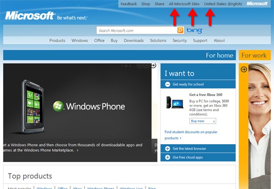 Meta navigation on Microsoft’s website.
Regardless of what you call these additional navigation items, it’s important to be flexible and recognize when “standards” don’t apply. Louis Rosenfeld, who’s been traveling the world advising people on usability for 15 years now, gives a great example of the importance of flexibility: he says that “in a faceted system (think the Epicurious recipe database’s navigation), there is no ‘primary’ — they’re all equally weighted.”

In fact, most web apps, or websites that deal with managing large subsets of data like The New York Times, Amazon.com, or Google, might find that even the primary navigation is hard to pin down.
 Sets of navigation highlighted on a Google search results page.
Instead, sites like these are controlled by a collection of panels or blocks which are customized to a user’s experience. In these cases, the user is less likely to browse through the site versus actively looking for the web pages they need, relying on featured content presented to them based on their site activity and site search for navigating the site.
What Standards Do You Use?
With all this different nomenclature flying around the Web, we’d like to hear back from readers. Do you call it “primary” or “global” navigation? What does “meta navigation” mean to you? How many of the sites you work on have a clearly defined primary navigation? Do you think we could be more effective as designers and developers if we standardized our navigation nomenclature a little more?
About the Author
 Jason Mark is an educator, business owner, and author. His Massachusetts-based firm, Gravity Switch, continues to be the leader in web, iPhone and iPad development in New England, and Jason keeps their carbon footprint down by bicycling to work year round. Follow him on Twitter @jasonnmark.
via Saskia’s shared items in Google Reader: http://feedproxy.google.com/~r/SixRevisions/~3/aDzcSLaRtms/
You must log in to post a comment.